Qantas
Card Companion

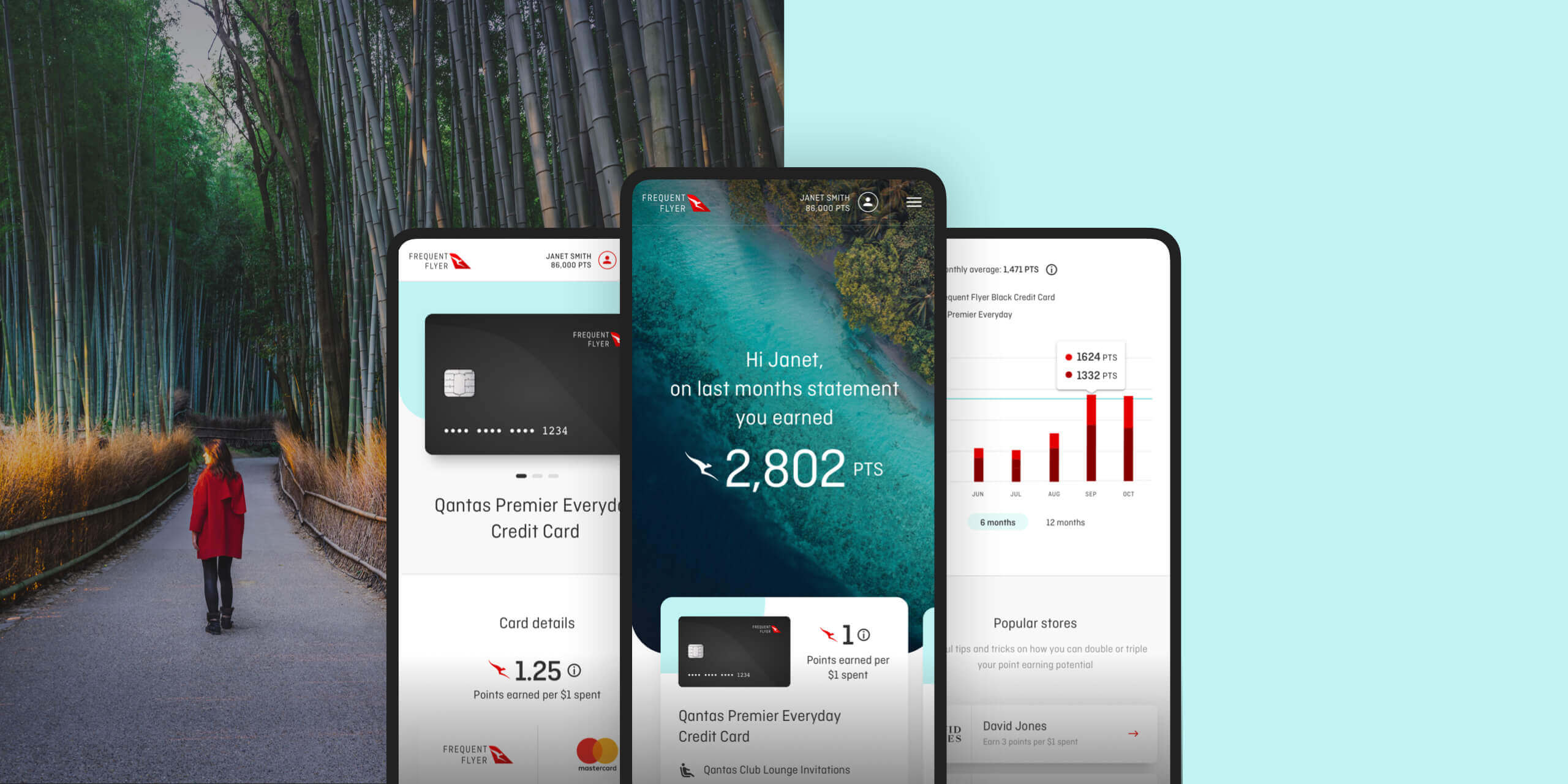
Creation of a web platform to help educate Qantas's card holders on the ways in which to earn, track and spend points.
The project
There are 12 million Qantas Frequent Flyer Members and 58% of all Qantas Points are earned through QPECCs (Qantas Points Earning Credit Cards). Qantas Loyalty wanted to build a new product for QPECC holders to track their points, view offers and rewards and maximise their point earning potential.
We helped them create a go-to portal for everything "Qantas Points" related: Users can link a series of Credit Cards and track their earning history, maximise it with special offers and eventually set goals to be able to spend them on what they love.
Acting as the lead front-end developer, I built the majority of the visible parts of the platform: some data visualization tools with Nivo, an animated onboarding experience with CSS transitions, a component library with Storybook, and a consistent and scalable overall UI built using Styled System.
01
Component Library
Even though Qantas had an existing internal component library, we decided to create our own, specific to this project whilst leveraging some of their existing components.
Using Storybook allowed us to drastically improve our collaboration with designers, and, from tiny modules to full pages, progressively build up the product and test it in various application states.
02
Data visualisation
A major feature of this product is to track how many Qantas points a user earned in the last twelve months.
Using the amazing data visualisation library called Nivo, I prototyped the first iterations of this component and progressively customised it to add business and UI logic to it.
03
The onboarding animations
After having created most of the UI rapidly but consistently (thanks to the amazing Styled System library), we wanted to focus on finessing the onboarding experience.
This is when we added a series of CSS transitions and animations with packages like next-page-transitions to effortlessly transition between pages.